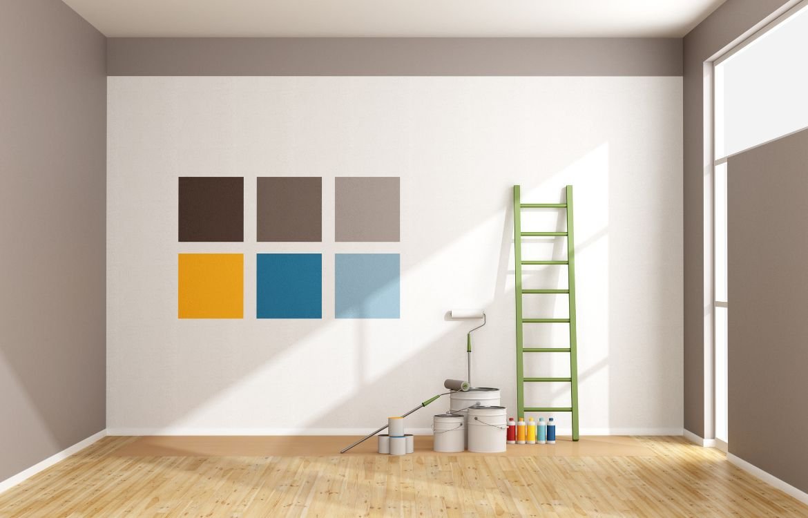
The Comprehensive Guide to Home Paint Colors: Achieving Balance, Harmony, and Beauty
Are you searching for a comprehensive guide that will help you achieve balance, harmony, and beauty through the perfect paint colors for your home interior painting? Look no further! We have create this Comprehensive Guide to Home Paint Colors to Achieving Balance, Harmony, and Beauty for homeowners like you.
In this guide, we’ll provide you with expert advice, practical tips, and inspiring ideas to help you navigate the wonderful world of paint colors. So, let’s dive in and discover how you can create a harmonious and beautiful ambiance that truly reflects your unique style and personality.
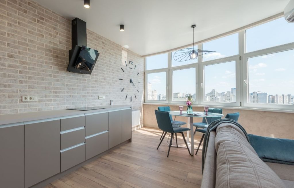
Analogous Colors
Color Characteristics:
When it comes to working with analogous colors, we’re dealing with hues that sit adjacent to each other on the color wheel. This creates a harmonious and seamless effect, as these colors share similar characteristics. Analogous colors often possess a similar level of brightness or saturation, resulting in a cohesive and balanced visual experience. They can create a sense of unity and flow within a space, making it visually appealing and pleasing to the eye.
Color Psychology and Mood Influence:
Analogous color schemes can have a significant impact on the mood and atmosphere of a room. For example, using warm analogous colors like red, orange, and yellow can create a vibrant and energetic ambiance, perfect for spaces where you want to promote enthusiasm and creativity. On the other hand, cool analogous colors such as blue, green, and purple can evoke a sense of calmness and tranquility, making them ideal for areas intended for relaxation or meditation.

Impact on Room Size Perception:
One of the advantages of working with analogous colors is their ability to affect the perceived size of a room. By selecting lighter shades within the analogous color scheme, you can create the illusion of a larger space. This is particularly useful for smaller rooms or areas with limited natural light. The seamless transition between the colors gives a sense of expansiveness, making the room feel more open and airy.
Color Applications:
Analogous color schemes are versatile and can be effectively used in various rooms and areas within your home. They work particularly well in spaces where you want to establish a sense of harmony and continuity. Consider using analogous colors in areas such as living rooms, bedrooms, and open floor plans where you want a smooth transition from one area to another. However, it’s essential to consider the purpose of the room and the desired atmosphere when selecting analogous colors.

Harmony and Balance:
Creating harmony and balance is a key aspect of working with analogous colors. Since these colors share a common thread, they naturally complement each other, resulting in a visually cohesive and balanced environment. You can play with different shades and intensities within the analogous color scheme to add depth and interest while maintaining overall harmony. It’s important to strike a balance and avoid overwhelming the space with too many intense or saturated colors.
Creating a Focal Point:
While analogous color schemes are primarily about creating a seamless flow, you can still use them to create a focal point or draw attention to specific areas or architectural features within a room. By introducing a slightly contrasting color from outside the analogous scheme, you can create visual interest and make certain elements stand out. This subtle variation can enhance the overall design and add a touch of excitement to the space.
Experimenting with Accents and Undertones:
When working with analogous colors, don’t be afraid to experiment with accents and undertones to add depth and dimension to your design. Consider incorporating neutrals or slightly contrasting shades to create visual interest. This can be done through accent walls, furniture pieces, or decor accessories. These subtle variations will help prevent the design from becoming monotonous while maintaining the overall harmony of the color scheme.
More:
Want to read more about analogous colors and their influence on their influence on home ambience? Read our blog post here.
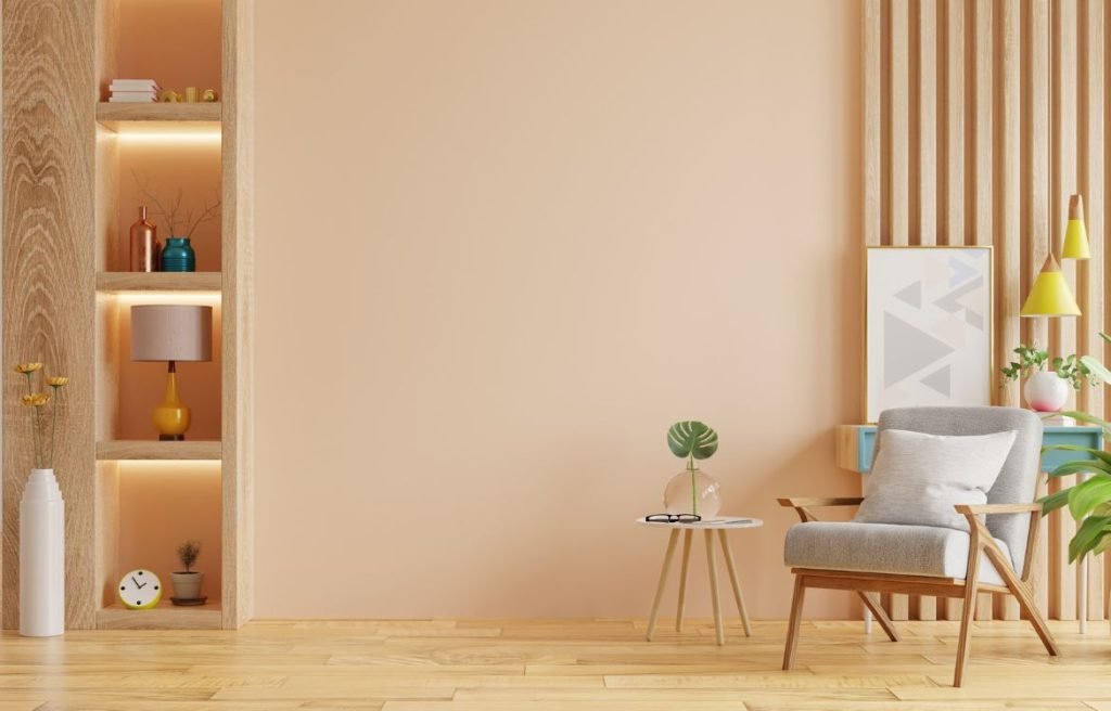
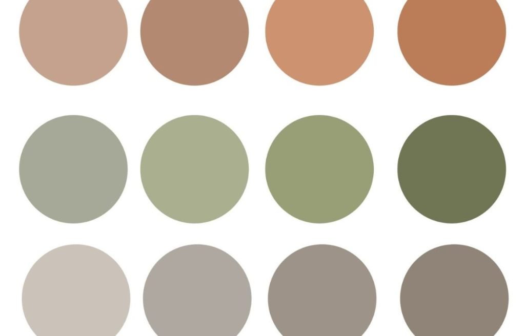
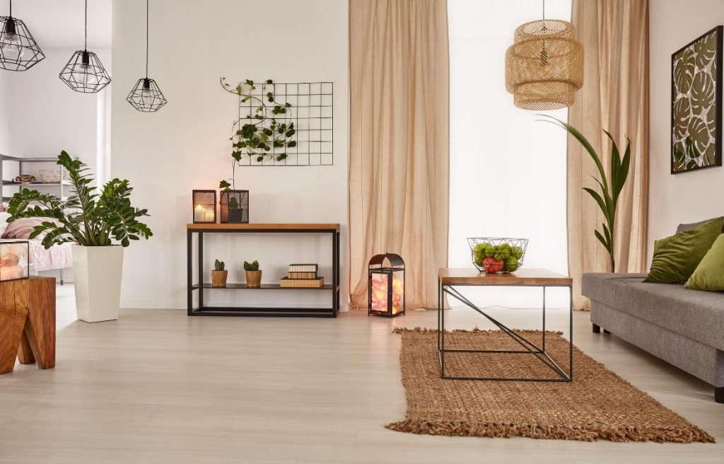
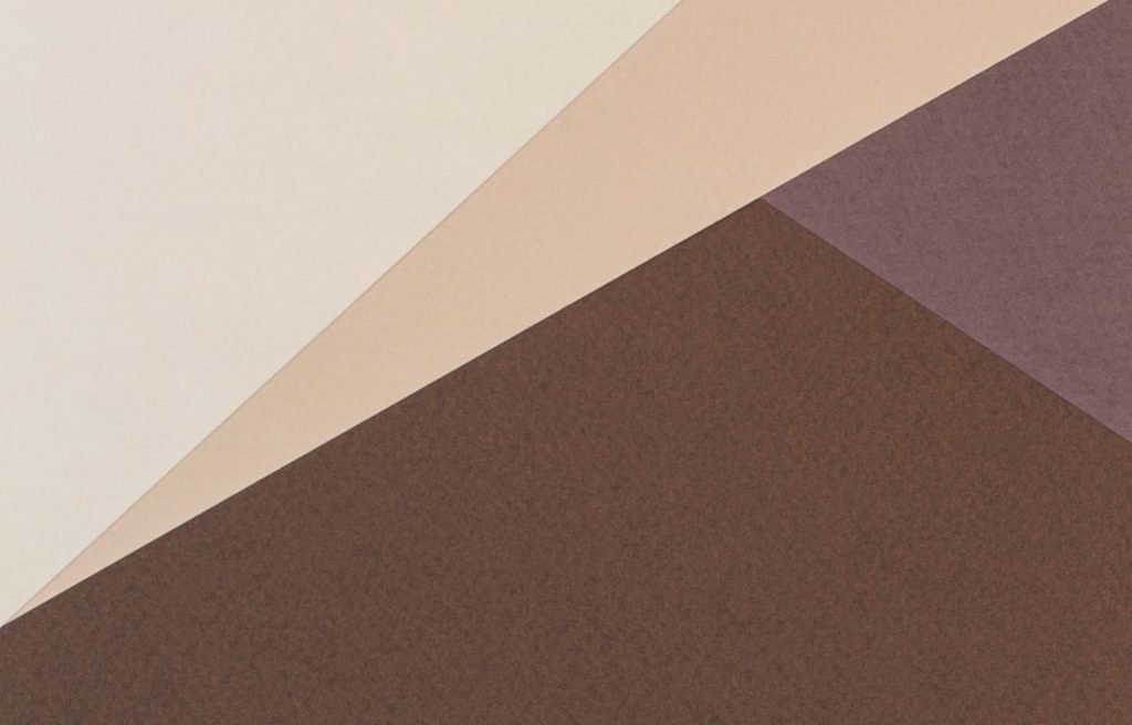
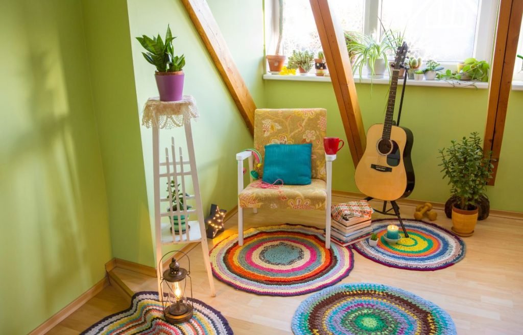
Earth Tones
Color Characteristics:
Earth tones encompass a range of colors inspired by nature, such as browns, beiges, tans, and greens. These colors are often warm and have a sense of groundedness and earthiness. Earth tones can vary in brightness, from muted and soft to rich and deep. They exude a sense of warmth, comfort, and connection to the natural world. With their organic qualities, earth tones create a cozy and inviting atmosphere, perfect for establishing a soothing and harmonious environment within your home.
Color Psychology and Mood Influence:
Earth tones have a profound psychological impact on the mood and atmosphere of a room. Their warm and natural qualities evoke feelings of serenity, stability, and relaxation. These colors can create a sense of balance and grounding, making them ideal for spaces where you want to foster a calm and tranquil ambiance. Earth tones can promote a feeling of harmony with nature, helping to reduce stress and create a peaceful retreat within your home.
Impact on Room Size Perception:
Earth tones can have a significant impact on the perceived size of a room. Lighter earth tones, such as beige and soft greens, can make a space feel more open and spacious. They reflect light and create an airy atmosphere, making them suitable for smaller rooms or areas with limited natural light. Darker earth tones, like deep browns and rich terracotta, add depth and coziness to a room, but they can make the space appear smaller. It’s important to consider the size and natural lighting of the room when selecting earth tones to achieve the desired visual effect.
Color Applications:
Earth tones find their place in various rooms and areas within your home. They work well in living rooms and bedrooms, creating a warm and inviting ambiance. Earthy greens can bring a sense of tranquility to bathrooms or home offices, while natural stone-inspired earth tones add elegance to kitchens and dining areas. Consider the purpose and desired atmosphere of each room to determine which earth tones will best suit your space.
Harmony and Balance:
Earth tones naturally contribute to the harmony and balance of a room. They create a sense of cohesion and connection to nature. Earth tones can be paired with other complementary colors, such as soft blues or warm oranges, to enhance the overall harmony and balance within a space. They also work well with natural materials like wood or stone, creating a seamless integration between elements and adding to the organic feel of the room.
Creating a Focal Point:
Earth tones can be used to create a focal point or highlight architectural features within a room. By incorporating a slightly contrasting color or a deeper shade of the earth tone, you can draw attention to specific areas or elements. For example, a deep brown accent wall can create a focal point behind a fireplace, while lighter earth tones can emphasize the beauty of exposed brick or wood beams. Earth tones allow you to highlight the natural beauty of architectural details in your space.
Experimenting with Accents and Undertones:
Within the realm of earth tones, you can experiment with accents and undertones to add depth and interest to a room. Consider incorporating accents in complementary colors, such as pops of warm orange or subtle hints of cool blue. Undertones within the earth tones themselves, like reddish undertones in browns or yellow undertones in greens, can create visual complexity and intrigue. These subtle variations add depth and dimension to your design, making the space more visually appealing and engaging.
More:
Read our blog post if you want to create a natural and organic vibe with earth tones.
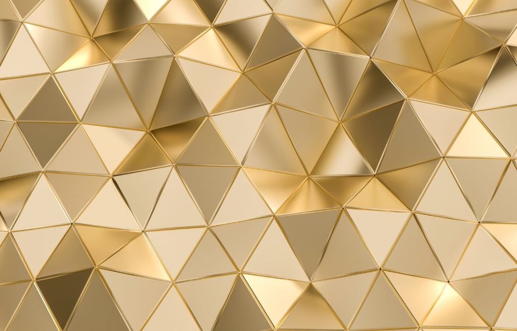
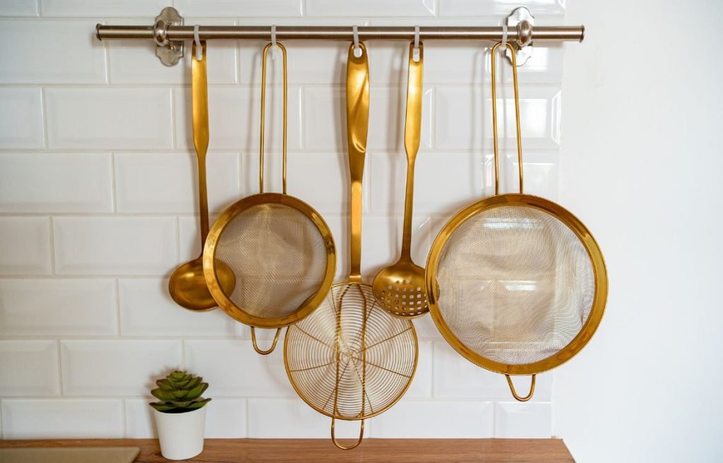
Metallic Colors
Color Characteristics:
Metallic colors, such as gold, silver, bronze, copper, and platinum, possess a distinctive sheen and shimmer. They reflect light, creating a captivating and dynamic visual effect. Metallic hues can range from warm and rich tones to cool and sleek shades. Each metallic color brings its own unique character and allure to a room, allowing you to express your personal style and create a statement.
Color Psychology and Mood Influence:
Metallic colors evoke a sense of opulence, grandeur, and luxury. Gold, for example, symbolizes wealth and prosperity, while silver conveys a modern and sleek aesthetic. The choice of metallic color can influence the mood and atmosphere of a room. Warm metallic hues like gold and bronze can create a cozy and inviting ambiance, while cool metallic shades like silver and platinum offer a more contemporary and sophisticated feel. These colors add an element of glamour and elevate the overall aesthetic of a space.
Impact on Room Size Perception:
The reflective nature of metallic colors can impact the perceived size of a room. Lighter metallic tones, such as silver or pale gold, have the ability to make a space appear larger by bouncing light around the room and creating an airy feel. On the other hand, darker metallic shades, like bronze or copper, can add depth and richness to a room, making it feel more intimate and cozy. Consider the desired effect you want to achieve when incorporating metallic colors into your space.
Color Applications:
Metallic colors can be used in various ways to enhance different areas of your home. They work exceptionally well as accents and focal points. Consider incorporating metallic hues through decorative accessories, such as mirrors, picture frames, or metallic-finish furniture. Metallic wallpapers or textured wall coverings can also make a bold statement, especially in entryways or feature walls. In addition, metallic finishes can be applied to fixtures, hardware, or lighting, adding a touch of sophistication to kitchens and bathrooms.
Harmony and Balance:
When working with metallic colors, it’s important to achieve a harmonious balance with other elements in the room. Metallic hues can be paired with neutral tones like whites, creams, or grays to create an elegant and timeless aesthetic. They also complement deeper jewel tones like emerald green, sapphire blue, or amethyst purple, creating a rich and luxurious atmosphere. Strive for a cohesive color palette that allows metallic accents to stand out while maintaining overall visual harmony.
Creating a Focal Point:
Metallic colors excel at creating focal points and drawing attention to specific areas or architectural features within a room. Incorporate metallic accents strategically to highlight a fireplace, an art display, or a statement piece of furniture. Their reflective properties naturally attract the eye and create a sense of visual interest. When using metallic colors to create a focal point, ensure that they complement the overall design scheme and add to the desired ambiance.
Experimenting with Accents and Undertones:
Metallic colors offer an opportunity to experiment with accents and undertones, adding depth and interest to a space. Consider incorporating metallic accents with different undertones, such as warm gold with warm neutrals or cool silver with cool blues. This interplay of colors and finishes can create a dynamic and visually captivating environment. Be mindful of striking the right balance and not overwhelming the space with excessive metallic elements.
More:
Create magic in your home by using metallic colors. Don’t know how? Read our blog.
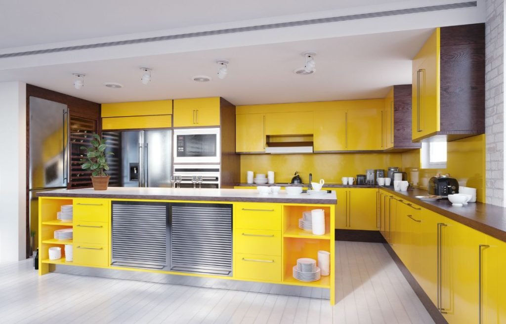
Bold Colors
Color Characteristics:
Bold colors are characterized by their intensity and strong visual impact. These hues are vibrant, saturated, and often demand attention. They can range from deep and rich tones to bright and vivid shades. Bold colors create a sense of drama and excitement, allowing you to infuse your space with personality and make a bold statement. Whether you opt for bold walls, furniture pieces, or accents, these colors will undoubtedly catch the eye.
Color Psychology and Mood Influence:
Bold colors have a significant psychological impact, evoking different emotions and moods. Reds, for instance, can energize and stimulate, while yellows promote happiness and optimism. Blues can create a sense of calmness and tranquility, while greens evoke feelings of freshness and rejuvenation. The choice of bold colors can influence the mood and atmosphere of a room. Consider the desired emotional response and the intended function of the space when incorporating bold hues.

Impact on Room Size Perception:
Bold colors can have an impact on the perceived size of a room. Darker bold colors, like deep blues or rich purples, can make a space feel more intimate and cozy. They add depth and warmth, making large rooms feel cozier and more inviting. On the other hand, brighter bold colors, such as vibrant yellows or intense oranges, can create a sense of spaciousness and openness. They reflect light and can make smaller rooms appear larger. Consider the scale of the space and the desired visual effect when choosing bold colors for your room.
Color Applications:
Bold colors can be used in various ways to make a statement in your home. You can opt for bold walls as a focal point, painting an entire room or just an accent wall to create a strong visual impact. Alternatively, you can incorporate bold colors through furniture pieces, upholstery, or decorative accessories like rugs, pillows, or artwork. Consider layering bold colors with neutrals or complementary shades to create a balanced and visually appealing composition.
Harmony and Balance:
When working with bold colors, it’s important to achieve a sense of harmony and balance within the space. While bold colors demand attention, they should still work cohesively with the overall design scheme. Consider the color palette as a whole, ensuring that the bold colors complement and enhance other elements in the room. Use neutrals or softer shades to provide a visual break and create a balanced composition.
Creating a Focal Point:
Bold colors are ideal for creating focal points and drawing attention to specific areas or architectural features within a room. Whether it’s a bold accent wall, a vibrant piece of furniture, or an eye-catching artwork, these elements will naturally become the center of attention. Use bold colors strategically to highlight the unique features of your space and create a focal point that reflects your style and personality.
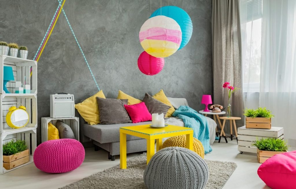
Experimenting with Bold Color Accents:
Bold color accents are an excellent way to infuse your space with pops of vibrant color without overwhelming the entire room. You can incorporate bold accents through accessories like throw pillows, curtains, rugs, or statement lighting fixtures. These accents add visual interest and create focal points within the room. Experiment with different color combinations and placement to achieve the desired effect.
More:
Bold colors are great to create accents. Read our blog post and use them for doors and trim.
Warm Colors
Color Characteristics:
Warm colors consist of shades that are reminiscent of the sun, fire, and earth tones. They include hues like reds, oranges, yellows, and warm browns. Warm colors have a higher saturation level and evoke a sense of energy and intimacy. They can range from deep and rich tones to lighter and softer shades. These colors have the ability to make a space feel cozy, inviting, and full of life.
Color Psychology and Mood Influence:
Warm colors have a significant psychological impact on our emotions and moods. Red, for example, is associated with passion, energy, and excitement. It can stimulate conversation and create a lively atmosphere. Orange is warm and inviting, promoting feelings of enthusiasm and creativity. Yellow is often associated with happiness, optimism, and warmth. Warm browns can provide a sense of grounding and stability, creating a comfortable and reassuring ambiance. Understanding the emotional impact of warm colors can help you select the right hues for each room in your home.

Impact on Room Size Perception:
Warm colors have the ability to visually advance or make a space feel more intimate. Darker warm colors, such as deep reds or rich browns, can make a large room feel cozier and more intimate. They absorb light and create a sense of depth and warmth. Lighter warm colors, like soft yellows or peachy tones, can make a small room feel more spacious and airy. They reflect light and create an open and inviting atmosphere. Consider the size and desired atmosphere of each room when choosing warm colors.
Color Applications:
Warm colors can be used in various ways to create a comforting and inviting environment. Consider painting walls in warm tones to set the mood for a cozy living room, bedroom, or dining area. Warm-colored furniture pieces, such as a deep red sofa or a warm wood dining table, can add a touch of richness and comfort. Soft furnishings like curtains, rugs, and throw pillows in warm hues can instantly create a cozy and inviting atmosphere. Use warm colors strategically to create focal points or highlight architectural features within a room.

Harmony and Balance:
When incorporating warm colors into your home, it’s essential to achieve a harmonious and balanced composition. Consider the overall color palette and ensure that warm colors complement other elements in the room. Pair warm colors with neutral tones like whites, creams, or beiges to create a balanced contrast. Cooler colors like blues or greens can be used as accents to provide visual balance. Achieving harmony among the colors will create a cohesive and visually pleasing space.
Creating a Focal Point:
Warm colors are ideal for creating focal points and drawing attention to specific areas or architectural features within a room. You can use a bold warm color on an accent wall to create a visually striking focal point. Alternatively, you can incorporate warm-colored artwork, an eye-catching light fixture, or a statement piece of furniture to serve as the centerpiece of the room. Warm colors naturally attract attention and create a cozy and inviting ambiance.

Experimenting with Accents and Undertones:
Warm colors can be complemented by experimenting with accents and undertones. Consider incorporating complementary colors or shades with similar warmth to create a harmonious composition. For example, pairing deep reds with earthy browns or soft yellows with warm oranges can create a visually appealing combination. Play with different shades and intensities within the warm color spectrum to add depth and interest to your space.
More:
Transform your home with warm colors. Get some inspiration in our blog post here.
Cool Colors
Color Characteristics:
Cool colors include shades of blue, green, and purple. They have a lower saturation level and are often described as calm, soothing, and refreshing. Cool colors can range from deep and intense tones to lighter and softer shades. They evoke a sense of serenity and create a visually calming effect. Cool colors are perfect for creating a peaceful and tranquil environment in your home.
Color Psychology and Mood Influence:
Cool colors have a significant psychological impact on our emotions and moods. Blue is known for its calming and serene qualities, evoking feelings of tranquility and peace. Green is associated with nature and can promote a sense of balance and harmony. Purple often symbolizes luxury and spirituality, bringing a sense of calm and relaxation. Understanding the emotional influence of cool colors can help you create a soothing and peaceful atmosphere in your space.

Impact on Room Size Perception:
Cool colors have the ability to visually recede or make a space feel more spacious. Lighter cool colors, such as soft blues or pale greens, can create a sense of openness and airiness. They reflect light and make small rooms appear larger. Darker cool colors, like deep blues or rich purples, can add depth and create a cozy and intimate atmosphere. They absorb light and make large rooms feel more intimate. Consider the size and desired atmosphere of each room when selecting cool colors.
Color Applications:
Cool colors can be used in various ways to create a tranquil and serene environment. Consider painting walls in cool hues to establish a calming atmosphere in bedrooms, bathrooms, or meditation spaces. Cool-colored furniture pieces, such as a serene blue sofa or a soothing green accent chair, can contribute to a peaceful ambiance. Soft furnishings like curtains, rugs, and throw pillows in cool tones can enhance the tranquility of a space. Use cool colors strategically to create a sense of calmness and relaxation.

Harmony and Balance:
When incorporating cool colors into your home, it’s important to achieve harmony and balance within the space. Consider the overall color palette and ensure that cool colors complement other elements in the room. Pair cool colors with neutrals like whites, grays, or soft creams to create a harmonious contrast. Warm accents or touches of complementary warm colors can provide visual interest and balance. Achieving harmony among the colors will create a cohesive and visually pleasing environment.
Creating a Focal Point:
Cool colors can be used to create focal points or draw attention to specific areas in a room. Consider using a bold cool color on an accent wall to create a visually striking focal point. Alternatively, incorporate cool-colored artwork, a unique lighting fixture, or a statement piece of furniture to serve as the centerpiece. Cool colors naturally create a sense of calm and focus, making them perfect for creating tranquil focal points in your space.
Experimenting with Accents and Undertones:
Cool colors can be enhanced by experimenting with accents and undertones. Consider incorporating complementary colors or shades within the cool color spectrum to create depth and visual interest. For example, combining shades of blue with hints of green or purple can add complexity and dimension to your space. Play with different intensities and undertones of cool colors to achieve the desired ambiance and visual appeal.
More:
Transform your home with cool colors. Get some inspiration in our blog post about cool colors.
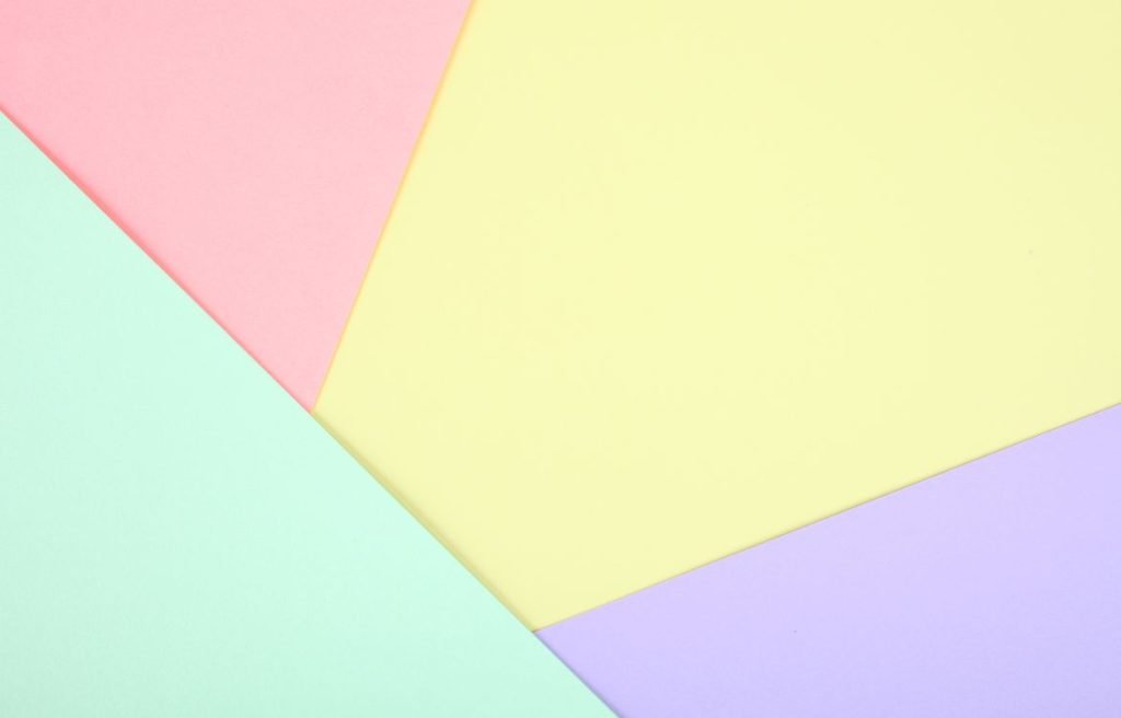
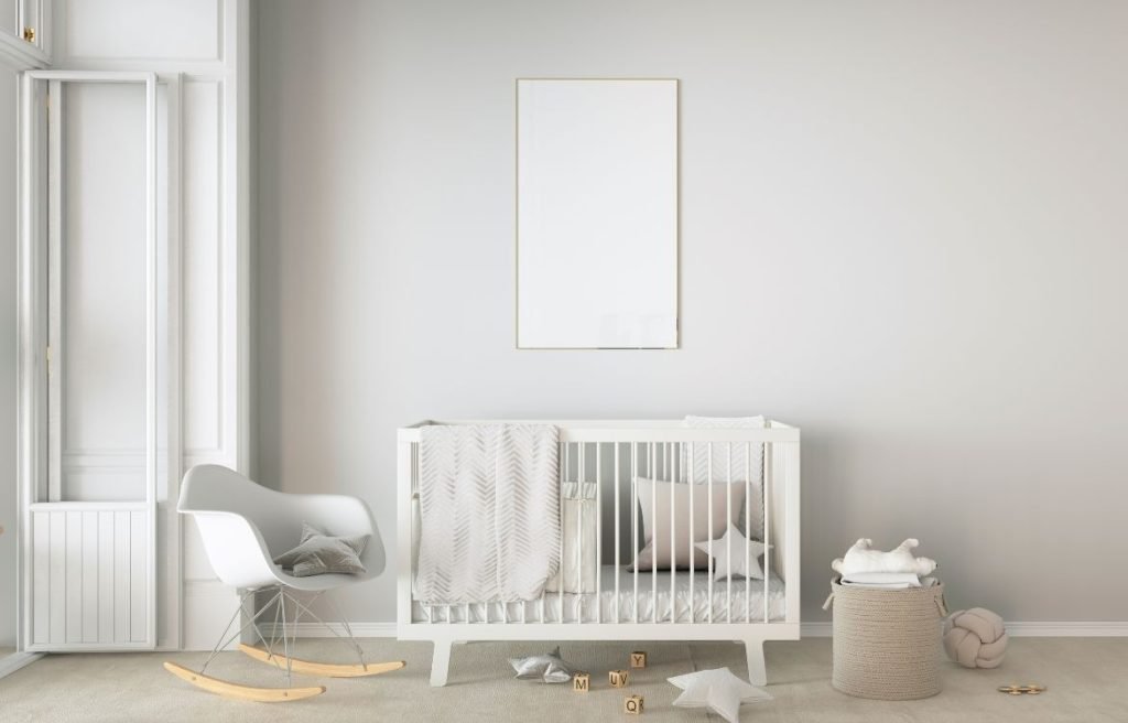
Pastel Colors
Color Characteristics:
Pastel colors are light and pale shades that have a lower saturation level. They are created by adding white to pure hues, resulting in soft and delicate tones. Pastel colors include gentle pinks, soft blues, light yellows, and tender greens. These colors have a calming and serene quality, radiating a sense of peace and elegance. Pastel colors are perfect for creating a gentle and refined aesthetic in your home.
Color Psychology and Mood Influence:
Pastel colors have a significant impact on our emotions and moods. They are known for their soothing and calming effects, promoting feelings of tranquility and relaxation. Gentle pinks can evoke a sense of sweetness and romance, while soft blues create a serene and peaceful ambiance. Light yellows can inspire joy and optimism, while tender greens bring a refreshing and rejuvenating vibe. Understanding the emotional influence of pastel colors can help you create a harmonious and soothing environment.
Impact on Room Size Perception:
Pastel colors have the ability to visually expand a space and create an airy atmosphere. Light and subtle pastel shades can make small rooms appear more spacious and open. They reflect light and create an illusion of a larger area. Additionally, pastel colors can add a sense of tranquility to larger rooms, making them feel cozy and inviting. Consider the size and desired ambiance of each room when incorporating pastel colors.
Color Applications:
Pastel colors can be incorporated into various aspects of your home decor to create a gentle and serene environment. Consider painting walls in pastel shades to establish a serene backdrop in bedrooms, nurseries, or living spaces. Pastel-colored furniture pieces, such as a blush pink armchair or a mint green side table, can add a touch of elegance and refinement. Soft furnishings like curtains, rugs, and bedding in pastel hues can enhance the delicate and tranquil atmosphere. Use pastel colors strategically to create a serene and charming space.
Harmony and Balance:
When using pastel colors in your home, it’s important to achieve harmony and balance. Consider the overall color palette and ensure that pastel colors complement other elements in the room. Pair pastel colors with neutral tones like whites, creams, or light grays to create a harmonious contrast. You can also combine different pastel shades to add depth and visual interest. Achieving harmony among the colors will create a cohesive and visually pleasing environment.
Creating a Focal Point:
Pastel colors can be used to create subtle and captivating focal points in your space. Consider using a slightly bolder pastel shade on an accent wall to draw attention to a particular area. Alternatively, incorporate a piece of artwork or a statement furniture item in a vibrant pastel color to serve as a centerpiece. Pastel colors naturally create a sense of tranquility and elegance, making them ideal for creating gentle focal points that enhance the overall ambiance of the room.
Experimenting with Accents and Undertones:
While pastel colors are soft and delicate on their own, you can experiment with accents and undertones to add depth and interest. Consider incorporating complementary colors or shades within the pastel color spectrum to create a subtle contrast. For example, combining blush pink with a touch of lavender or pairing soft blue with a hint of mint can add complexity and visual appeal. Play with different undertones and intensities to achieve the desired aesthetic and atmosphere.
More:
Create a serene and relaxing atmosphere with pastel colors.
Conclusion
Thank you for taking the time to explore The Comprehensive Guide to Home Paint Colors: Achieving Balance, Harmony, and Beauty. We hope this content has been insightful and inspiring, guiding you towards creating a home that fills your heart with joy.
At Horizon Painting, we understand the importance of finding the perfect paint colors to transform your living space. If you have any questions or need professional assistance with your painting project, don’t hesitate to contact us. Our team of experts is always here to help you achieve the home of your dreams. Reach out to us today and let’s turn your vision into a reality.