Working with Analogous Colors for Harmony
Welcome to our comprehensive guide on Working with Analogous Colors for Harmony! If you’re a homeowner looking to paint your house and create a harmonious and visually appealing environment, you’ve come to the right place.
In this article, we’ll delve into the art of using analogous paint colors to achieve balance, unity, and a sense of tranquility in your living spaces. Whether you’re a novice or an experienced painter, our step-by-step instructions, practical tips, and inspiring ideas will empower you to transform your home with the magic of color harmony.
Get ready to explore the fascinating world of analogous colors and discover how they can elevate the ambiance of your beloved home.
Introduction to Analogous Colors
In the world of color theory and design, understanding how different colors work together is key to creating visually pleasing and harmonious compositions. One such concept that plays a significant role in achieving color harmony is that of analogous colors. In this introductory section, we will explore the definition of analogous colors, discuss the importance of color harmony, and provide a brief explanation of how analogous colors contribute to creating harmonious visual experiences.
Analogous colors refer to a group of colors that are adjacent to each other on the color wheel. These colors share similar characteristics and have a natural affinity for one another. Typically, analogous color schemes involve using three to five colors that are neighboring each other on the color wheel, resulting in a harmonious and unified visual composition.

Importance of Color Harmony
Color harmony is a fundamental principle in design and art, as it creates a sense of balance, unity, and visual cohesion. When colors are harmoniously combined, they evoke specific emotions, set the mood of a space, and enhance the overall aesthetic appeal. Understanding and effectively working with analogous colors is an essential skill for achieving color harmony in various artistic and design endeavors.
How Analogous Colors Contribute to Harmony
Analogous colors contribute to harmony by providing a smooth and visually pleasing transition between colors. Since they share similar undertones, analogous colors create a sense of unity and balance when used together. The slight variations in hue, saturation, and value within the analogous color scheme add interest and depth to a composition while maintaining overall harmony.
When employing analogous colors, designers and artists can achieve a sense of natural progression and continuity in their work. The gradual shift from one color to another within the analogous color scheme creates a pleasing flow, captivating the viewer’s eye and creating a cohesive visual experience.
Color Theory Basics
To grasp the concept of analogous colors fully, it is essential to understand some basics of color theory. This foundation will help us navigate the color wheel and comprehend the relationships between different colors.
Primary, Secondary, and Tertiary Colors
In color theory, colors are categorized into three main groups: primary, secondary, and tertiary colors.
- Primary Colors: These are the foundational colors that cannot be created by mixing other colors. The primary colors are typically red, blue, and yellow.
- Secondary Colors: These colors result from mixing two primary colors. The secondary colors include green, orange, and purple.
- Tertiary Colors: Tertiary colors are achieved by mixing a primary color with a neighboring secondary color. Examples of tertiary colors include yellow-green, blue-violet, and red-orange.
Understanding the primary, secondary, and tertiary colors is crucial for comprehending the relationships between colors on the color wheel.
The Color Wheel
The color wheel is a circular representation of colors that demonstrates their relationships and organization. It is divided into twelve segments, with each segment representing a specific color. The arrangement of colors on the color wheel allows us to understand their harmonious connections and identify analogous colors.

Definition of Analogous Colors
Now that we have a foundational understanding of color theory, let’s explore the definition of analogous colors and how they are represented on the color wheel.
Explanation of Analogous Color Scheme
Analogous colors, as mentioned earlier, are colors that are adjacent to each other on the color wheel. They share similar undertones and exhibit a natural harmony when used together. Analogous color schemes involve selecting three to five colors that are neighboring each other on the color wheel.
Analogous color schemes are versatile and can evoke different moods based on the specific colors chosen. They provide a sense of unity and coherence in design while allowing for subtle variations and transitions between colors.
How Analogous Colors are created on the Color Wheel
To create an analogous color scheme, start by selecting a dominant color from the color wheel. This dominant color will serve as the focal point of your composition. Then, choose the colors adjacent to the dominant color on the color wheel to complete the analogous color scheme.
For example, if the dominant color chosen is blue, the adjacent analogous colors might include blue-green and blue-violet. These colors share common characteristics with blue while offering slight variations that add depth and interest to the overall composition.
The Psychology of Analogous Colors
Emotional Impact of Colors
Colors have a profound effect on our emotions and can significantly influence our mood and perception. In this section, we will explore the fascinating world of color psychology and understand how analogous colors contribute to evoking specific emotions and creating harmonious atmospheres.
- Overview of Color Psychology
Color psychology is the study of how colors impact human behavior, emotions, and cognitive processes. Different colors have distinct psychological effects and can elicit various emotional responses. Understanding these effects is crucial when working with analogous colors to create desired visual experiences.
- How Analogous Colors Affect Emotions and Mood
Analogous colors, being closely related on the color wheel, often evoke similar emotions and moods. While individual interpretations may vary, there are general associations and effects linked to specific analogous color combinations.
- Warm Analogous Colors: Analogous color schemes comprising warm hues like red, orange, and yellow tend to create a sense of energy, warmth, and excitement. They can evoke feelings of enthusiasm, happiness, and optimism. These colors are often associated with vitality, creativity, and action.
- Cool Analogous Colors: Analogous color schemes consisting of cool tones such as blue, green, and violet can evoke a sense of calmness, tranquility, and relaxation. These colors are often associated with serenity, harmony, and introspection. They can create a soothing and peaceful atmosphere.
It’s important to note that the intensity, saturation, and individual experiences can also influence the emotional impact of analogous colors. Experimentation and understanding the context in which you are using these colors will help you achieve the desired emotional and psychological effects in your design or space.
Cultural and Symbolic Associations of Analogous Colors
Analogous colors also hold cultural and symbolic significance, which adds another layer of meaning and interpretation to their use. These associations can vary across different cultures and contexts.
- Cultural Significance of Analogous Colors
Analogous colors may hold cultural significance and be linked to specific traditions, rituals, or cultural identities. For example, certain analogous color combinations might have religious or ceremonial importance in particular cultures. Understanding these cultural connotations can help you respect and honor diverse perspectives when working with analogous colors.
- Common Symbolic Meanings Associated with Analogous Colors
Analogous colors can be associated with symbolic meanings that have developed over time. While individual interpretations may vary, here are some common symbolic meanings connected to analogous color combinations:
- Red-Orange-Yellow: Passion, energy, vibrancy, enthusiasm
- Yellow-Green-Blue: Harmony, growth, tranquility, balance
- Blue-Violet-Red: Mystery, transformation, power, sensuality
It’s important to approach symbolic meanings with cultural sensitivity and recognize that interpretations may differ based on personal experiences and cultural backgrounds.

Creating Analogous Color Schemes
Selecting a Dominant Color
In the realm of analogous color schemes, the selection of a dominant color plays a pivotal role. This section will explore the significance of a dominant color and provide guidance on factors to consider when choosing one.
- Importance of a Dominant Color in Analogous Color Schemes
The dominant color acts as the anchor for your analogous color scheme, setting the overall tone and mood of your design. It serves as the primary focus and helps establish a visual hierarchy within your composition. By selecting a dominant color, you provide a cohesive foundation for the other analogous colors to harmoniously interact.
- Factors to Consider when Choosing a Dominant Color
When deciding on a dominant color for your analogous color scheme, consider the following factors:
- Purpose and Mood: Determine the purpose of your design and the intended emotional response. Each color carries its own energy and symbolism, so choose a dominant color that aligns with the desired mood. For example, warm hues like red can evoke passion and excitement, while cool tones like blue can convey calmness and serenity.
- Space and Lighting: Take into account the physical environment where your design will be displayed. Consider the lighting conditions, such as natural light or artificial lighting, as colors can appear differently depending on the lighting source. Additionally, consider the existing color palette in the space to ensure coherence and compatibility.
- Personal Preference: Trust your instincts and personal taste when selecting a dominant color. Your intuition and emotional connection to certain colors can guide you in choosing a color that resonates with you and reflects your vision.
Choosing Analogous Colors
Once you have established a dominant color, the next step is to determine the range of analogous colors that will complement and enhance your design. This section will provide tips for selecting analogous colors that work harmoniously.
- Determining the Range of Analogous Colors
To create an effective analogous color scheme, select colors that are adjacent to your dominant color on the color wheel. Typically, three to five neighboring colors are used in an analogous color scheme. Consider the following approaches:
- Gradual Transition: Choose colors that gradually shift in hue, moving from the dominant color to the adjacent colors. This creates a smooth transition and a visually pleasing progression.
- Varied Saturation and Value: Experiment with variations in saturation and value within the analogous color range. Adjusting the intensity and brightness of colors can add depth and visual interest to your design.
- Tips for Selecting Analogous Colors that Work Harmoniously
To ensure a harmonious analogous color scheme, keep the following tips in mind:
- Balance Warm and Cool Tones: Aim for a balanced mix of warm and cool analogous colors to create a dynamic and visually appealing composition. This balance helps avoid overwhelming or monotonous color schemes.
- Consider Contrast: While analogous colors share similarities, incorporating subtle contrasts can add intrigue and visual impact. Explore slight variations in saturation, value, or temperature to create depth and focal points within your design.
- Test and Adjust: Experimentation is key when selecting analogous colors. Create color swatches, sample palettes, or utilize digital tools to visualize how your chosen colors interact and adjust as needed. Trust your eye and make adjustments until you achieve the desired harmony.
Applying Analogous Colors for Visual Harmony
Creating Color Palettes
Color palettes are essential for effectively utilizing analogous colors in your designs. In this section, we will explore tools and resources for generating analogous color palettes and provide examples of visually appealing palettes.
- Tools and Resources for Generating Analogous Color Palettes
Numerous online tools and resources are available to help you create well-balanced and visually appealing analogous color palettes. These tools typically allow you to select a dominant color and generate neighboring analogous colors automatically. Some popular tools include:
- Adobe Color: A powerful tool that enables you to explore and create color palettes based on various color harmonies, including analogous colors.
- Coolors: An intuitive online platform that generates color schemes and allows you to tweak and customize them according to your preferences.
- Canva: A user-friendly design platform that provides pre-designed color palettes and allows you to create and customize your own.
- Color Hunt: A curated collection of color palettes created by designers, featuring numerous examples of analogous color schemes.
- Examples of Visually Appealing Analogous Color Palettes
To inspire your color palette creations, here are a few examples of visually appealing analogous color schemes:
- Dominant Color: Blue Analogous Colors: Blue, Blue-Green, Green
- Dominant Color: Red Analogous Colors: Red, Red-Orange, Orange
- Dominant Color: Yellow Analogous Colors: Yellow, Yellow-Green, Green
These examples demonstrate the seamless transition and harmonious blend of colors within the analogous color scheme. Feel free to experiment with different hues and variations to create unique and captivating color palettes.
Using Analogous Colors in Design
Analogous colors can be effectively utilized in various design applications, including websites, user interfaces, graphic design, and branding. Let’s explore how to incorporate analogous colors in these design contexts.
- Applying Analogous Colors to Websites and User Interfaces
When designing websites and user interfaces, analogous color schemes can enhance visual appeal and create a cohesive user experience. Consider the following approaches:
- Use the dominant color as the primary background or accent color, with the analogous colors serving as supporting elements or highlights.
- Employ color gradients or subtle variations within the analogous color range to indicate different states or actions.
- Ensure readability by employing sufficient contrast between text and background colors.
- Incorporating Analogous Colors in Graphic Design and Branding
Analogous colors can play a vital role in graphic design and branding, creating a distinctive visual identity. Consider the following techniques:
- Select analogous colors that align with the brand’s personality and values, evoking the desired emotions and associations.
- Utilize the dominant color as the primary color in the logo or design, with the analogous colors employed in secondary elements or supporting graphics.
- Explore variations in saturation and value to add depth and visual interest to the overall design.
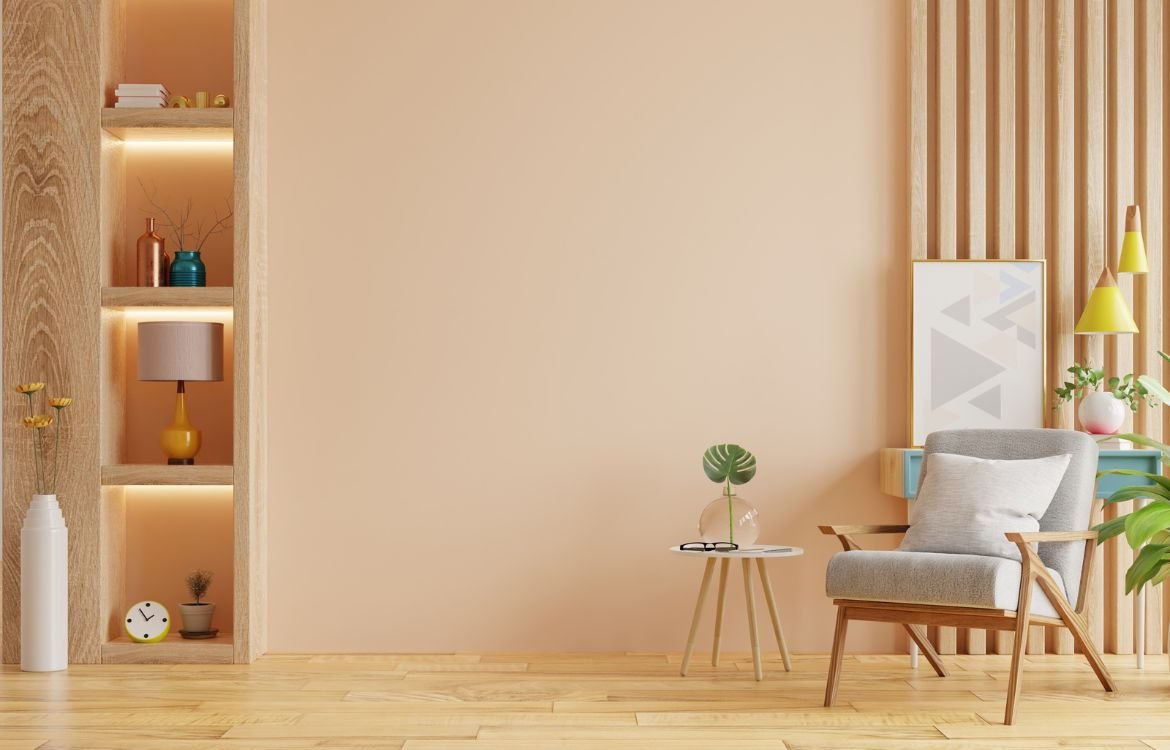
Using Analogous Colors in Interior Design
Analogous colors can also be applied effectively in interior design, creating harmonious and visually engaging spaces. Let’s explore how to incorporate analogous colors in different rooms and achieve a balanced interior.
- Applying Analogous Colors in Different Rooms
- Living Room: Use warm analogous colors to create an inviting and cozy atmosphere. For example, a combination of red, orange, and yellow can infuse the space with energy and vibrancy.
- Bedroom: Opt for cool analogous colors to promote relaxation and tranquility. Consider a blend of blue, green, and violet for a serene and soothing ambiance.
- Kitchen: Select bright and refreshing analogous colors like yellow, yellow-green, and green to create an uplifting and vibrant culinary space.
- Tips for Achieving a Balanced and Harmonious Interior using Analogous Colors
- Vary Intensity and Saturation: Experiment with different intensities and saturations within the analogous color range to add depth and visual interest.
- Neutralize with Neutrals: Integrate neutral colors such as white, beige, or gray to balance the vibrant analogous colors and prevent overwhelming the space.
- Consider Lighting: Take into account the natural and artificial lighting in the room, as it can influence how colors appear. Test the color palette under different lighting conditions to ensure desired effects.
Best Practices for Working with Analogous Colors
Contrast and Accent Colors
In this section, we will explore best practices for creating effective compositions using analogous colors, focusing on contrast and the incorporation of accent colors.
- Importance of Contrast in an Analogous Color Scheme
Contrast plays a crucial role in ensuring visual clarity and preventing a design from appearing flat or monotonous. While analogous colors share similarities, it’s essential to incorporate contrast to distinguish elements and enhance the overall composition. Consider the following techniques:
- Varying Lightness and Darkness: Choose analogous colors with distinct levels of lightness and darkness to create visual separation and hierarchy within your design.
- Employing Complementary Colors: Introduce complementary colors, which are opposite on the color wheel, to provide contrast and make certain elements stand out.
- Incorporating Accent Colors to Enhance the Overall Composition
Accent colors can add visual interest and create focal points within an analogous color scheme. By introducing a contrasting color or a color from a different color family, you can draw attention to specific elements or create dynamic visual effects. Some strategies to consider include:
- Selecting a Single Accent Color: Use a single contrasting color sparingly to create emphasis and highlight key elements in your design.
- Using Neutrals as Accent Colors: Integrate neutral colors such as black, white, or gray as accent colors to provide a subtle contrast and balance to the analogous color scheme.
Accessibility Considerations
When working with analogous colors, it’s important to ensure that your designs are accessible to people with visual impairments and maintain readability and usability. Consider the following tips:
- Ensuring Color Accessibility for People with Visual Impairments
- Contrast Ratios: Check that there is sufficient contrast between text and background colors to ensure readability, particularly for individuals with visual impairments. Use online contrast checking tools to assess the contrast ratios.
- Color Blindness Considerations: Take into account the various types of color blindness and ensure that important information is not solely conveyed through color. Incorporate additional visual cues such as icons, patterns, or labels to convey meaning.
- Tips for Maintaining Readability and Usability in Analogous Color Designs
- Text Legibility: Ensure that text remains legible against the background colors by selecting appropriate text colors with sufficient contrast.
- Use of White Space: Incorporate ample white space or negative space to provide visual breathing room and enhance readability and clarity within your design.
Tools and Resources for Working with Analogous Colors
Color Wheel and Palette Generators
In this section, we will explore helpful tools and resources for working with analogous colors, including color wheel and palette generators. These tools can assist in creating and refining your color schemes.
- Overview of Popular Color Wheel and Palette Generator Tools
- Adobe Color: A comprehensive online tool that allows you to create and explore color harmonies, including analogous colors. It offers various features such as color exploration, palette creation, and integration with Adobe Creative Cloud.
- Coolors: An intuitive online platform and mobile app that generates color schemes based on different harmonies, including analogous colors. It provides customization options, color locking, and export capabilities.
- Paletton: A color wheel and palette generator that allows you to create and modify analogous color schemes easily. It offers advanced color options, including tint, shade, and tone adjustments.
- Canva Color Palette Generator: Within the Canva design platform, you can generate color palettes based on different color harmonies, including analogous colors. It provides a user-friendly interface and additional design features.
- Features and Benefits of Each Tool
- Adobe Color offers powerful features, integration with design software, and a vast community for color inspiration and exploration.
- Coolors provides a simple and intuitive interface, customization options, and the ability to save and export your color palettes.
- Paletton offers detailed color adjustments, previews, and the option to view color schemes in various color models.
- Canva Color Palette Generator is ideal for users already working within the Canva platform, as it seamlessly integrates with other design features and templates.
Color Harmony Guides and References
To further enhance your understanding and exploration of color harmony, numerous resources are available that provide in-depth insights and practical guidance.
- Recommended Resources for Understanding and Exploring Color Harmony
- “Interaction of Color” by Josef Albers: A classic book that explores the principles of color harmony, perception, and interaction through various exercises and visual examples.
- “The Elements of Color” by Johannes Itten: This book delves into color theory, including harmonies and contrasts, and provides practical exercises for creating balanced color compositions.
- Online Color Resources: Websites like color-hex.com, colourlovers.com, and sessions.edu offer color tools, resources, and inspiration for working with color harmonies.
- Books, Websites, and Online Communities for Further Learning
- Pantone Color Institute: Pantone, a renowned color authority, provides resources, articles, and trend forecasts to deepen your understanding of color and its application.
- Color Design Community: Engage with the color design community on platforms such as Behance, Dribbble, and Reddit’s r/Colorists to learn from and collaborate with other color enthusiasts.
Conclusion
Thank you for joining us on this journey into the realm of Working with Analogous Colors for Harmony. We hope that this guide has provided you with valuable insights, inspiration, and practical knowledge to embark on your house painting project with confidence. Remember, at Horizon Painting, we’re here to help you every step of the way. If you have any questions, need further guidance, or would like professional assistance, don’t hesitate to contact our team of experts. Let us bring your vision to life and create a harmonious living space that reflects your unique style and personality. Together, we can transform your house into a vibrant and harmonious home. Contact us at Horizon Painting today and let’s start painting your dreams!